
Leere Seite als Vorlage
Diese Seite mit ihren Einstellungen soll als Vorlage für andere Seiten dienen.
Dieser Text kann mit der horizontalen Linie gelöscht werden
Titel 1
Text als Paragraph formatiert
Titel 2
Text
Titel 3
Text
Titel 4
Text
Titel 5
Text
Titel 6
Pre formatierter TextAls Adresse formatierter TextNameStrasseOrt
Text
ProDocs: Advanced theme for complex documentation sites
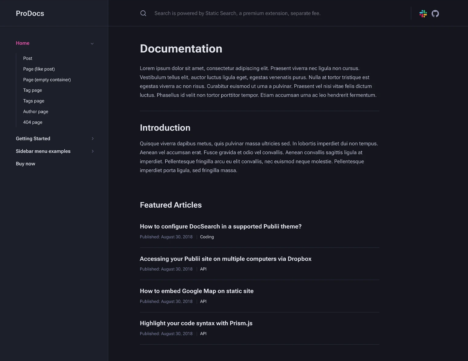
ProDocs offers a modern and flexible foundation for creating high-quality documentation websites. With full compatibility for Publii plugins like syntax highlighting and search, plus auto-generated table of contents, it enables a clean, accessible, and customizable reading experience that adapts seamlessly across devices. The theme includes collapsible sidebar navigation and customizable post layouts for different page types, making it work well for extensive API docs, multi-product knowledge bases, or developer portals where users need to navigate through multiple layers of content.
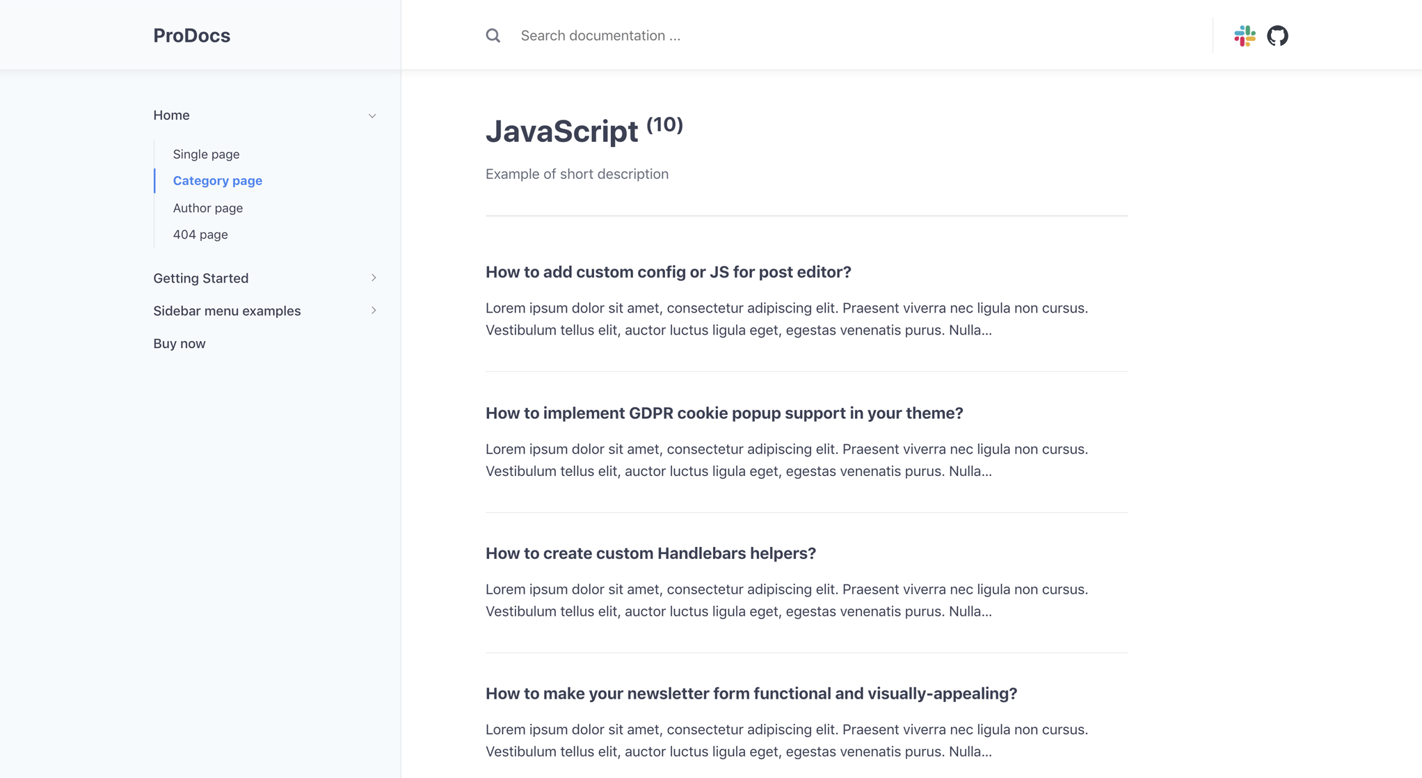
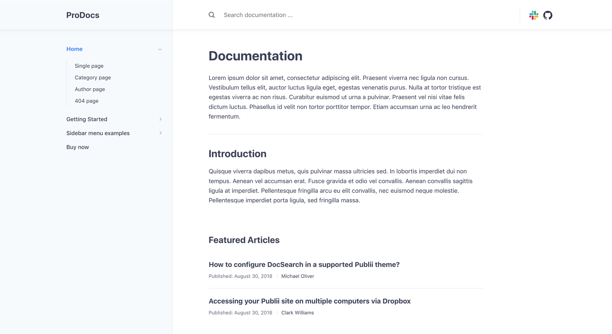
Customizable post listing layouts
A block layout gives you control over article preview appearance, with toggles for displaying titles, dates, text, author names, and more. Each post listing type — tag pages, author pages, frontpage — gets its own set of options. You can create unique layouts for each type. The frontpage includes special options for featured articles and latest articles sections, letting you highlight important content or recent updates separately.
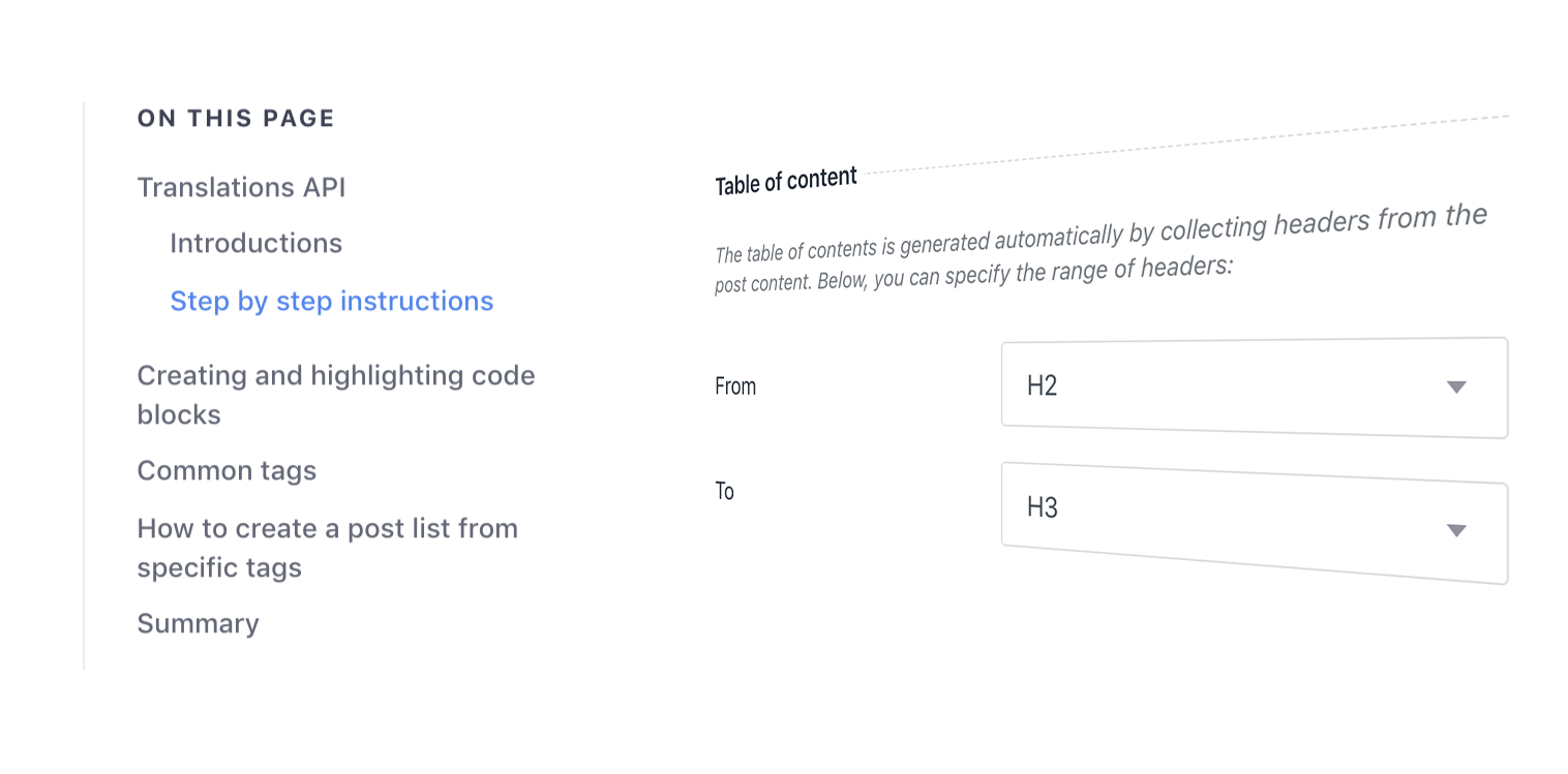
Auto-generated table of contents
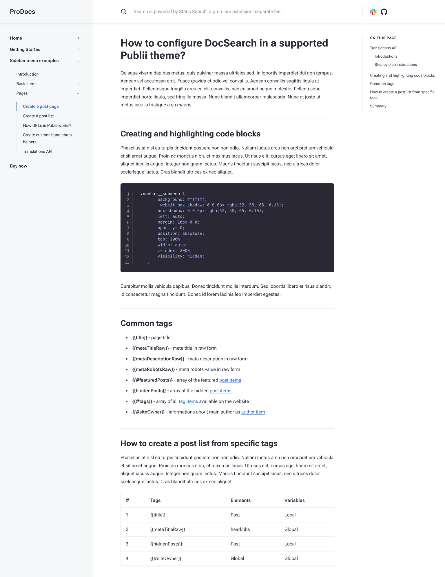
For longer documentation, ProDocs includes a TOC generator that automatically creates a full table of contents in the right sidebar, with individual anchor links to each header element in the post. The header range is user-specified, so you can choose whether you want to link to all subsections individually, the main Header 2 elements, or anything in between. This helps readers jump to specific sections without scrolling through entire articles.
Light and dark color modes
ProDocs introduces two distinct color scheme modes: Light Mode and Dark Mode. Users can select their preferred mode or choose the Auto option, which adjusts the color scheme to match the user’s operating system settings. If the operating system doesn’t support auto-detection, the theme defaults to Light Mode.
The theme offers six unique color schemes for each mode:
- Light Mode: Blue, Brown, Gray, Green, Mint, and Soft Lavender.
- Dark Mode: Blue, Brown, Green, Midnight Navy, Olive Shadow, and Stormy Night.
You can customize the color schemes directly from the user interface or by modifying CSS variables. The UI allows quick adjustments to base and accent colors without requiring any coding knowledge. For advanced users, the option to create entirely custom color schemes by directly editing the CSS provides maximum flexibility. This setup lets you tailor ProDocs to meet branding requirements or personal preferences.
Code highlighting with Prism.js
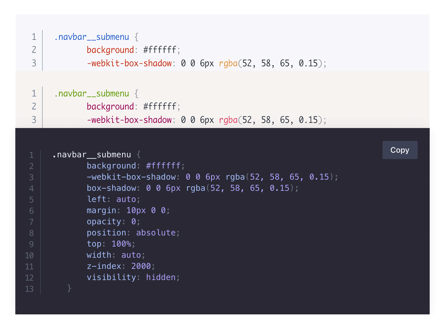
The Syntax Highlighter plugin brings Prism.js code highlighting to ProDocs. It renders code more readable with clear presentation that helps developers and readers quickly understand the content. The plugin supports a wide range of programming languages and includes customization options, letting you adjust the appearance of code snippets to match your preferences or branding.
SideNav menu with collapsible submenus
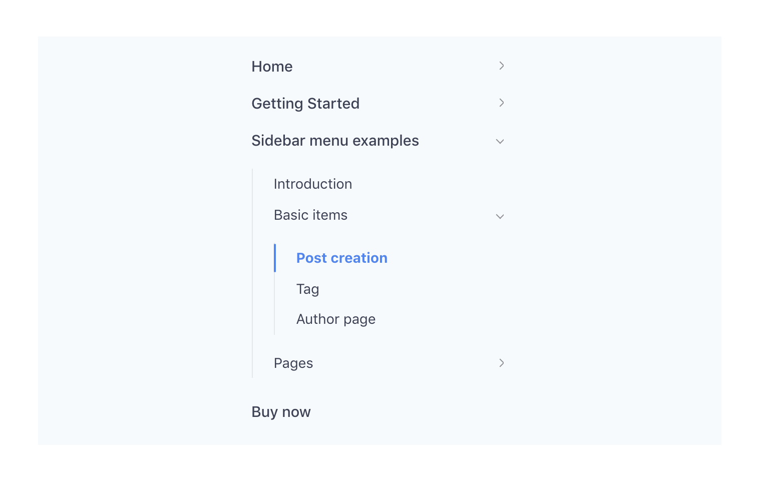
When there’s a lot of documentation to read through, users need to find what they need fast. ProDocs includes a SideNav menu in the left sidebar that’s always available, with collapsible submenus for a cleaner, clearer layout. The navigation structure helps organize complex documentation into manageable sections, making it easier for users to browse multiple layers of content without getting lost.
Fluid typography for any screen
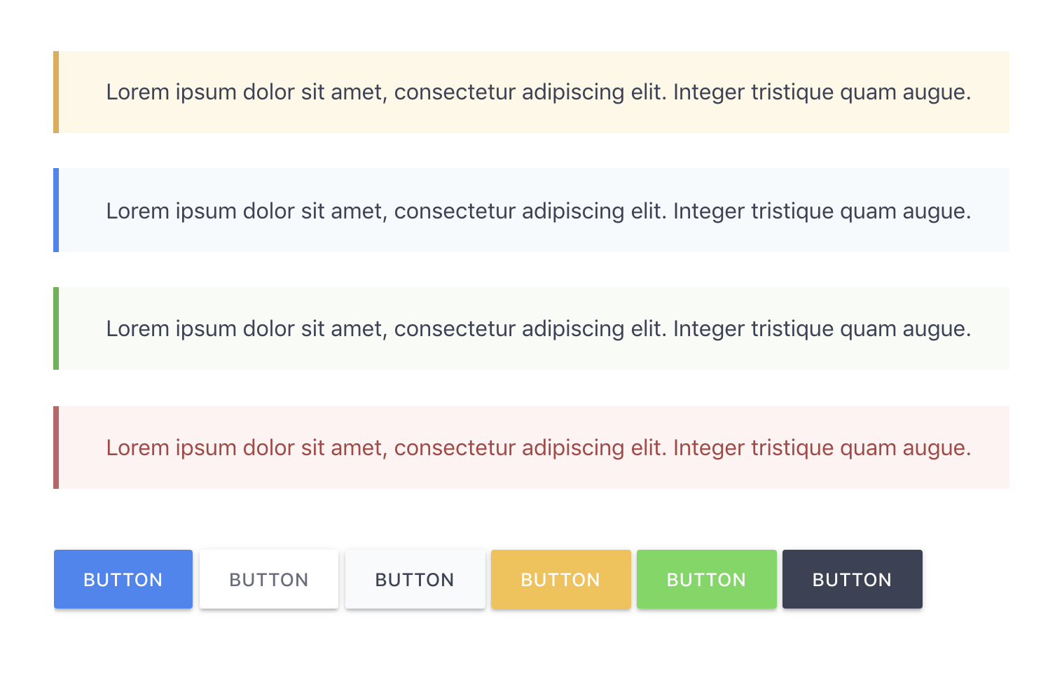
Like all Publii themes, ProDocs includes a variety of typography options such as warnings, buttons, and tip-boxes to clearly separate your content. It uses fluid typography to resize text to precisely fit the screen size, making it clear and readable no matter what device is being used. These styled elements help organize information and make important notices stand out from regular text.
Typography
This is a Heading 2
Pellentesque et aliquet ipsum, vitae luctus urna. Sed mollis massa a porttitor iaculis. Lorem ipsum dolor sit amet, consectetur adipiscing elit.
This is a Heading 3
Pellentesque et aliquet ipsum, vitae luctus urna. Sed mollis massa a porttitor iaculis. Lorem ipsum dolor sit amet, consectetur adipiscing elit.
This is a Heading 4
Pellentesque et aliquet ipsum, vitae luctus urna. Sed mollis massa a porttitor iaculis. Lorem ipsum dolor sit amet, consectetur adipiscing elit.
This is a Heading 5
Pellentesque et aliquet ipsum, vitae luctus urna. Sed mollis massa a porttitor iaculis. Lorem ipsum dolor sit amet, consectetur adipiscing elit.
This is a Heading 6
Pellentesque et aliquet ipsum, vitae luctus urna. Sed mollis massa a porttitor iaculis. Lorem ipsum dolor sit amet, consectetur adipiscing elit.
Paragraph One – Lorem ipsum dolor sit amet, consectetur adipiscing elit. Suspendisse rhoncus gravida neque, quis convallis libero sollicitudin vitae. Morbi et lacus metus. Maecenas tincidunt suscipit nulla, ac egestas ligula luctus vitae. In hac habitasse platea dictumst.
Paragraph Two – Lorem ipsum dolor sit amet, consectetur adipiscing elit. Suspendisse rhoncus gravida neque, quis convallis libero sollicitudin vitae. Morbi et lacus metus. Maecenas tincidunt suscipit nulla, ac egestas ligula luctus vitae. In hac habitasse platea dictumst.
- Unordered Lists.
- Lorem ipsum dolor sit amet, consectetur adipiscing elit.
- Lorem ipsum dolor sit amet, consectetur adipiscing elit.
- Numeric List.
- Lorem ipsum dolor sit amet, consectetur adipiscing elit.
- Lorem ipsum dolor sit amet, consectetur adipiscing elit.
- DL list
- Lorem ipsum dolor sit amet, consectetur adipiscing elit
- DL list
- Lorem ipsum dolor sit amet, consectetur adipiscing elit
- Lorem ipsum dolor sit amet, consectetur adipiscing elit
This is a blockquote. Lorem ipsum dolor sit amet, consectetur adipiscing elit. Suspendisse rhoncus gravida neque, quis convallis.
Highlight text by using the mark tag
This text type should be treated as deleted
This text type should be treated as inaccurate or updated
This text type should be considered an addition to the document
This text will be displayed as underlined
This text type should be treated as fine print for contracts
This text will be displayed as bold
This text will be displayed in italics
Table
You can easily add extra styling table to your content by selecting the right element from the Formats menu of the WYSIWYG editor toolbar.
By default all tables look like:
| # | Date | City | Country |
|---|---|---|---|
| 1 | October 29th, 2017 | Ramillies | France |
| 2 | September 20th, 2018 | Dufftown | Japan |
| 3 | October 15th, 2018 | Kircudbright | Antarctica |
| 4 | March 1st, 2019 | South Burlington | Virgin Islands |
with .table-bordered class added:
| # | Date | City | Country |
|---|---|---|---|
| 1 | October 29th, 2017 | Ramillies | France |
| 2 | September 20th, 2018 | Dufftown | Japan |
| 3 | October 15th, 2018 | Kircudbright | Antarctica |
| 4 | March 1st, 2019 | South Burlington | Virgin Islands |
with .table-striped class added:
| # | Date | City | Country |
|---|---|---|---|
| 1 | October 29th, 2017 | Ramillies | France |
| 2 | September 20th, 2018 | Dufftown | Japan |
| 3 | October 15th, 2018 | Kircudbright | Antarctica |
| 4 | March 1st, 2019 | South Burlington | Virgin Islands |
with .table-title class added:
| # | Date | City | Country |
|---|---|---|---|
| 1 | October 29th, 2017 | Ramillies | France |
| 2 | September 20th, 2018 | Dufftown | Japan |
| 3 | October 15th, 2018 | Kircudbright | Antarctica |
| 4 | March 1st, 2019 | South Burlington | Virgin Islands |
You can easily mix the table styles but adding two classes e.g.: .table-bordered .table-striped
| # | Date | City | Country |
|---|---|---|---|
| 1 | October 29th, 2017 | Ramillies | France |
| 2 | September 20th, 2018 | Dufftown | Japan |
| 3 | October 15th, 2018 | Kircudbright | Antarctica |
| 4 | March 1st, 2019 | South Burlington | Virgin Islands |